lola
Regular Trader

Posts: 95
|
Post by lola on Nov 9, 2007 18:13:53 GMT -5
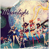
 I only made two but I find I like this one the best ^+^ |
|
|
|
Post by Kajouka on Nov 10, 2007 13:02:04 GMT -5
alright, look at me! Two months in a row entering something graphical *hides*  And just a question for you icon savvy people. What type of fonts do you use for icons, because most of my fonts just don't look good at the smaller pixel sizes. Thanks! |
|
Lauchis
Super Trader
Mrs. Lovett
Posts: 1,082
|
Post by Lauchis on Nov 11, 2007 15:25:34 GMT -5
Hmmm for pixel fonts I use any font from here, they all look good in smaller sizes. For the rest of the fonts... I tend to go crazy when I use them, never use the same one. But if you're using anti-alias they shouldn't not look good ^_^ |
|
Shiro
Crisis Trader
Posts: 618
|
Post by Shiro on Nov 12, 2007 13:02:08 GMT -5
I tend to like using Arial or Arial Bold for my small fonts - usually set to size 3-5. Size 3 or 4 is generally for when I put two or three spaces between each letter like this. And for really small font that's impossible to read but still looks kinda neat (like this) I use size 1. XD I use a lot of other random fonts too for larger text like this, but it's mostly a matter of trial and error to see what looks good. But yeah, anti-alias is also helpful. :3 |
|
Liz
Star Trader
Kinsei ni kawatte, oshiokiyo! :D
Posts: 423
|
Post by Liz on Nov 12, 2007 13:37:23 GMT -5
 lalala, I really need to practice more. v_v |
|
Cerri
Super Trader
~Myuu Fan~
Posts: 1,116
|
Post by Cerri on Nov 12, 2007 13:59:49 GMT -5
Psh, I think it's adorable : )
|
|
|
|
Post by Lady Chani on Nov 12, 2007 14:24:52 GMT -5
I tend to like using Arial or Arial Bold for my small fonts - usually set to size 3-5. Size 3 or 4 is generally for when I put two or three spaces between each letter like this. And for really small font that's impossible to read but still looks kinda neat (like this) I use size 1. XD I use a lot of other random fonts too for larger text like this, but it's mostly a matter of trial and error to see what looks good. But yeah, anti-alias is also helpful. :3 I hate tiny-text so much..... I've always wondered who came up with the idea of 'hey, let's make text really freaking small so it's like this line of dots that look like they should be words'. All the same, I love your icons. |
|
Fujiko
Super Trader
la la la
Posts: 1,190
|
Post by Fujiko on Nov 22, 2007 3:58:45 GMT -5
 Mine.. I made two and ended up choosing this one. Tiny text anyone? >< |
|
|
|
Post by Dite Hart on Nov 28, 2007 13:55:54 GMT -5
I'm sort of braindead at the moment, and I can't think of anything. This is if animated ones are allowed. This didn't turn out the way I wanted, so, if we're allowed to remake it, I might remake it if I think of something better before it's time to choose... I need to pick a background color other than the red. (The "Marker coloring over the avatar" idea wasn't so good anyway, so I'll probably use the beige or the pink) It'll look better, and do a better job of emphasizing the red. I just don't feel like it right now, though... But, I saved it as a PSD.  |
|
|
|
Post by Britti on Dec 2, 2007 22:31:24 GMT -5
@.@ Results will be posted later this week and the new contest tomorrow~.
|
|


 and don't forget to visit my trading post